Making Thai Readable in the Herdr Terminal: Two Font Merges to Get It Right
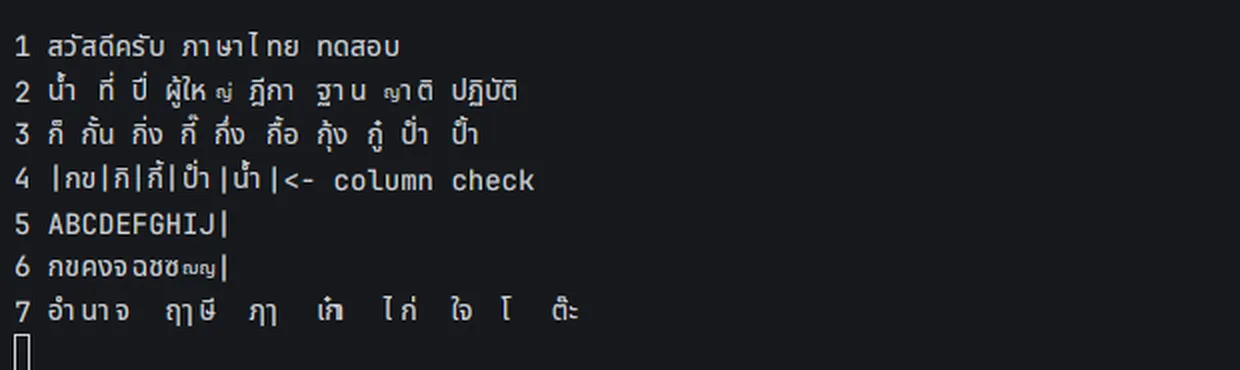
I use Herdr to keep all my terminals and coding agents in one place. It does everything well except Thai: wide letters like ญ shrink to ant size, spacing is uneven, and some tone marks land in the wrong place. So I asked Claude Code (running inside Herdr itself) whether it could be fixed, and whether anyone had reported it.
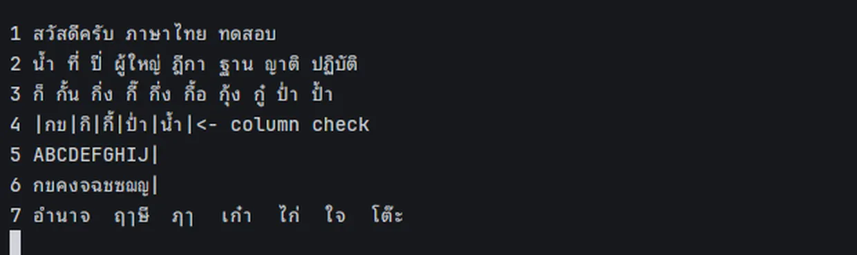
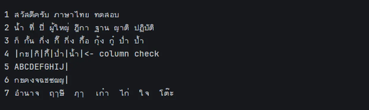
It took two font merges. The first was technically correct but hard to read; the second was the one. Before on top, after below:
Step one: where is the problem?
A Herdr terminal has two halves: herdr-core keeps the screen, and the app draws it. Reading the screen from the core with hc read gave back every Thai character intact, so the data was fine. The problem was in the drawing.
The cause: JetBrains Mono, the default terminal font, has no Thai at all, so the app falls back to Noto Sans Thai. That font is proportional. ญ is about one and a half cells wide, so it gets squeezed into one cell until it is tiny, while narrow letters like า float in the middle of theirs.
How to fix it? Herdr’s settings.json takes a single font; there is no “use this font for Thai”. Nobody had reported Thai problems in the herdr-app, herdr or herdr-core issue trackers. Claude drafted an English issue with screenshots, but I held off, because I had a question first.
The question: does Thai even fit in a grid?
I wondered whether a terminal, which splits everything into equal cells, was a poor fit for Thai from the start. Maybe ญ should take two cells, or the stacked vowels needed ligatures.
The answer was the opposite. Thai fits a grid much better than I expected:
- Consonants, leading vowels (เ แ โ ใ ไ) and า ะ take one cell each.
- Vowels above and below and the tone marks (ั ิ ี ุ ู ่ ้ ๊ ๋ ็ ์) are zero-width: they stack on the consonant in the same cell. No ligatures needed.
- The only awkward one is ำ: it counts as one cell, but its small circle has to sit over the previous consonant.
- Thai typewriters have been monospaced for over a century.
Making ญ two cells wide is not an option. Every program in a terminal (bash, vim, Claude Code) works out character widths itself and counts ญ as one. If the app drew it as two, the cursor and the rest of the line would drift.
So the grid is fine; the font isn’t built for it. The fix: one font file with JetBrains Mono’s Latin and Thai glyphs fitted to its cells, set as Herdr’s font.
Round one: Tlwg Mono, correct but hard to read
The first candidate was Tlwg Mono from the TLWG project, a Thai monospace font whose glyphs are 600 units wide, exactly like JetBrains Mono. With fontTools I copied its Thai glyphs into JetBrains Mono, scaled them 10% to match the Latin height, and made the vowels and tone marks zero-width, shifted back over the previous letter.
It got everything right: full-size ญ and ฌ, aligned columns, tone marks in place.
But after a day of real use, my verdict was: hard to read, the old font was easier. Tlwg Mono’s Thai is thin and typewriter-like, while Noto, squeezed or not, was designed for screens. I switched back.
Round two: Noto Sans Thai Looped, fitted to the grid without losing its look
This time I picked Noto Sans Thai Looped, the variant with loops. The hard part is that Noto isn’t monospaced, so each glyph has to be fitted by hand:
- Subset to Thai, keeping Noto’s positioning rules (
ccmp,locl,mark,mkmk). These are what lift a tone mark above an upper vowel, as in ที่ or กิ่ง. - Fit every glyph to one cell. Scale Thai to 95% and centre it in the 600-unit cell. Letters still too wide, like ญ ฌ ณ, are narrowed horizontally only, keeping their full height, so they no longer shrink.
- Move the anchors too. Noto positions vowels and tone marks with anchors on the consonant. When a consonant is shifted or narrowed, its anchors must move by the same transform, or the marks end up beside it.
- Merge into JetBrains Mono and name the result “JetBrains Mono Thai”.
Two problems turned up on the way:
- Taller lines. When merging, fontTools kept the larger line metrics, Noto’s, so the whole terminal spread out. Fixed by forcing JetBrains Mono’s metrics back.
- “ฤๅ” lost a cell. Noto has a ligature (
rlig) that joins ฤ and ๅ into one glyph. That looks nice on a web page, but in a terminal those are two characters in two cells; joined into one, everything after shifts left. Fixed by dropping that ligature.
The result is the “after” image at the top: looped Thai, stroke weight close to the Latin, full-height ญ ฌ ณ, marks in place, one character per cell.
Worth remembering
hc readtells you whether the problem is the data or the drawing. If the core's text is intact, don't chase encodings.- Herdr reads the font list only at startup. After installing a font or changing
font, restart the window. Terminals and agents keep running in herdr-core meanwhile. herdr-app shotsaves the last frame drawn. If the window is on a workspace you aren't looking at, the app draws no new frames and you get a stale picture.- A merged font doesn't update itself. When JetBrains Mono releases a new version, rerun the build script.
Not done yet
I haven’t reported this to Herdr. The lasting fix is a fallback-font setting in Herdr, so nobody writing Thai has to merge fonts. The font has also only been tested with Herdr on one Linux machine.
Try it
The build script, build-merge.py, is in this gist. You need JetBrains Mono and Noto Sans Thai Looped installed:
uv run --with fonttools python build-merge.py \
  JetBrainsMonoNerdFont-Regular.ttf NotoSansThaiLooped-Regular.ttf \
  JetBrainsMonoThai-Regular.ttf Regular /tmp
Repeat for Bold, Italic and Bold Italic, put the files in ~/.local/share/fonts, set "font": "JetBrains Mono Thai" in ~/.config/herdr-app/settings.json, and restart Herdr. It works in any other terminal that takes a single font, too.
— Ben